Accessible Accordion
Accordion widgets require some accessibility considerations to make them useful for everyone. In this article we explain what you need to do to create accessible, inclusive accordion components.
Accordions are a common UX pattern that can help reduce the amount of information presented to users. You might recognise this pattern by other names, such as collapsible sections, show/hide content, among others.
Accordions relate to the UX technique of progressive disclosure(opens in a new tab), which aims to maintain the focus of a user's attention by reducing clutter, confusion and cognitive workload. It works by only present details of a section upon a tap or click, if necessary.
Concerning its visual and interaction design, Smashing Magazine published a great article on how to design the perfect accordion(opens in a new tab).

⛔ No Accordion
Long content can overwhelm users.

✅ With Accordion
The page is decluttered as it only shows content when users want to read it.
An accordion is a list of items, each composed with two parts: a header and a panel, as shown in the figure below.
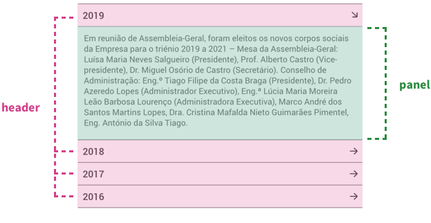
- Header
Summary of the section of content we want to hide/show. It also serves as the visibility control of the content (hint:
<button>), meaning it is interactive with a mouse and keyboard.It usually contains a title describing the section, and a visual indicator of the visibility state of the accordion item.
- Panel
The section of content we want to show/hide.
When the accordion is closed, the content inside the panel shouldn't be visible or interactable (e.g.: focusable elements shouldn't be focusable when they are not visible on screen).
Given its benefits, it can be tempting to use accordions whenever possible, but this can often do more harm than good.
Nielsen Norman Group gives some criteria on when to use accordions and when to avoid using it.
In short, when all the page content is relevant to users, it is more advantageous to show all the content at once, even if doing so results in longer pages. On the desktop it is easier to simply scroll the page than to decide on which topics to click on
.
As HTML doesn't natively provide an accordion element, we need to implement this widget by making sure it is accessible to keyboard and screen reader users.
That's what we will cover next. The implementation we will take as example comes from the "Design Patterns and Widgets"(opens in a new tab) in the WAI-ARIA Authoring Practices 1.2(opens in a new tab).
| Element | Key | Required | Action |
|---|---|---|---|
Element: header | Key: Enter or Space | Required: ✅ | Changes the collapsed/expanded state of the associated panel. |
Element: header | Key: Arrow Down | Required: ✖️ | Moves focus to the next accordion header. |
Element: header | Key: Arrow Up | Required: ✖️ | Moves focus to the previous accordion header. |
Element: header | Key: Home | Required: ✖️ | Moves focus to the first accordion header. |
Element: header | Key: End | Required: ✖️ | Moves focus to the last accordion header. |
| Element | Attribute | Role | Required | Notes |
|---|---|---|---|---|
Element: header | Role: button | Required: ✅ | The title of each accordion header is within a <button />. | |
Element: header | Attribute: aria-controls | Required: ✖️ | Each button within an accordion header, is associated with its corresponding panel by using aria-controls="<panel-id>" | |
Element: header | Attribute: disabled | Required: ✖️ | If a panel can't be collapsed (e.g.: at least one panel needs to be open), that is indicated using the disabled attribute | |
Element: header | Attribute: aria-expanded | Required: ✅ | Each accordion header has an ARIA attribute identifying the state of its corresponding panel:
| |
Element: panel | region | Required: ✖️ | Each panel is a <section /> and uses its associated accordion header as its label, by using the attribute aria-labelledby="<header-id>". This can be helpful for screen reader users to perceive the structure of the accordion.Note: In some circunstances this is not advisable, as it can lead up to a huge number of |
Following the keyboard and ARIA expectations mentioned below, the complete accordion widget can be implemented as follows:
<div><h3><button id="accordion-header-1"aria-expanded="true"aria-controls="accordion-panel-1">Item 1<svg aria-hidden="true">...</svg></button></h3><section id="accordion-panel-1"aria-labelledby="accordion-header-1"><p>Lorem ipsum dolor sit amet...</p></section><h3><button id="accordion-header-2"aria-expanded="false"aria-controls="accordion-panel-2">Item 2<svg aria-hidden="true">...</svg></button></h3><section id="accordion-panel-2"aria-labelledby="accordion-header-2"hidden><p>Lorem ipsum dolor sit amet...</p></section></div>
Let's break down the demo into parts, and see how and why we use each attribute.
The starting HTML structure of your accordion depends on the context where you use it. Next, we'll see some common contexts where accordions can be used and how to structure your HTML accordingly.
Sections of Content
Whenever you want to use an accordion in a sequence of sections of content, your markup can look like follows:
<!-- Header --><h3><button>Item 1</button></h3><!-- Panel --><section><p>Lorem ipsum dolor sit amet ...</p></section>
Header
To match the webpage document structure, we should pick the correspondent heading level where the accordion will be placed within the page. This could be anything from an <h2 /> to an <h6 />. In our example, we're using the <h3 /> heading.
Another aspect of the accordion header, since it's also an interactible element, is that we should use a <button> element, making it available to use not only by mouse users, but also by keyboard users.
Panel
As for the accordion panel, we can make use of <section /> attribute, which is also a region landmark. This makes the accordion panel appear in screen readers that support navigation by landmarks.
Note: in some circunstances this is not advisable, as it can lead up to a huge number of region landmarks. If you have more than 6 accordion items, you should consider using a div instead.


Definition Lists
It's often common to use the accordion pattern within a definition list. An example of this would be an FAQ within a page, as the example below shows.
In this case, we should use the <dt> for the header and the <dd> for the panel instead.
<dt><dt><!-- Header --><button>Is this an FAQ question?</button></dt><dd><!-- Panel -->Yes, it is.</dd><dt><button>What about this one?</button></dt><dd>Yap, this too.</dd><!-- ... more questions ... --></dl>


Field Groups
Another common use of the accordion component, is within a group of checkbox fields. Amazon uses this in it's faceted search, where users can filter products with certain properties, such as brand, as the example below shows.
In this case, we should use the <legend> for the header and use a wrapping elmenent (such as a <div>) for the panel instead.
<fieldset><!-- Header --><legend><button>Filter by Brand</button></legend><!-- Panel --><div><div><input id="apple" name="brand" type="checkbox" /><label for="apple">Apple</label></div><div><input id="motorola" name="brand" type="checkbox" /><label for="motorola">Motorola</label></div></div><!-- more brands... --></fieldset>
Mark icon as decorative
Most accordions, including the one in our example, have an icon in their header that help users visualize the state of the accordion. As this icon is just an extension of the accordion state (which will talk more later on), we should mark this icon as a decorative icon, hiding it from assistive technology users.
To do this, we can add aria-hidden="true attribute to the icon as we show below.
<svg aria-hidden="true">...</svg>
For the rest of this guide, we will use the accordion pattern in the context of sections of content
The next thing we need to do, is to mark the relationship between the accordion header and panel, as follows:
Assign unique id's
To make the accordion header and panel "identifiable" when assigning the relationships between them, we first need to assign unique id's to both of them.
<h3><button id="accordion-header-1">Item 1</button></h3><section id="accordion-panel-1"><p>Lorem ipsum dolor sit amet ...</p></section>
Relationship: Header "controls" the Panel
The accordion header controls the state of the accordion panel. To mark this relationship, we can make use of the aria-controls attribute, which value is the id of the accordion panel (in this case, accordion-panel-1).
<h3><button id="accordion-header-1"aria-controls="accordion-panel-1">Item 1<svg aria-hidden="true">...</svg></button></h3><section id="accordion-panel-1"><p>Lorem ipsum dolor sit amet ...</p></section>
Relationship: Panel is "labelled" by the Header
As we're using a <section /> as the accordion panel, we can make use of the panel header as the label of this element. This will make sure it is correctly identifiable in screen readers that support navigation by landmark.
To achieve this, we can use the aria-labelledby attribute on the accordion panel, which value should be the id of the corresponding accordion header.
<h3><button id="accordion-header-1"aria-controls="accordion-panel-1">Item 1<svg aria-hidden="true">...</svg></button></h3><section id="accordion-panel-1"aria-labelledby="accordion-header-1"><p>Lorem ipsum dolor sit amet ...</p></section>
The last thing to do, is to have the accordion state (opened vs. closed) being communicated to screen reader users.
Opened State
To mark the accordion item as opened, we can use the aria-expanded attribute on the accordion header and set its value to true.
<h3><button id="accordion-header-1"aria-controls="accordion-panel-1"aria-expanded="true">Item 1<svg aria-hidden="true">...</svg></button></h3><section id="accordion-panel-1"aria-labelledby="accordion-header-1"><p>Lorem ipsum dolor sit amet ...</p></section>
Closed State
To mark the accordion item as closed, we can use the aria-expanded attribute on the accordion header and set its value to false.
This is not enough for the closed state. We also need to prevent the accordion panel from being reached by both keyboard and screen reader users. One of the ways to do this is to use the attribute hidden on the accordion panel, which not only hides the panel visually but also makes it unreachable to keyboard and screen reader users.
<h3><button id="accordion-header-1"aria-controls="accordion-panel-1"aria-expanded="false">Item 1<svg aria-hidden="true">...</svg></button></h3><section id="accordion-panel-1"aria-labelledby="accordion-header-1"hidden><p>Lorem ipsum dolor sit amet ...</p></section>
Implementing an accordion in your framework (or no framework) can be a daunting task. Below we show simple implementations of the accordion pattern in several frameworks.
In all these examples, we're using the accordion pattern in the context of sections of content. As mentioned above, you should adapt the header and panel markup to match your context.
const accordionHeaders = document.querySelectorAll('data-accordion-header');Array.prototype.forEach.call(accordionHeaders, accordionHeader => {let target = accordionHeader.parentElement.nextElementSibling;accordionHeader.onclick = () => {let expanded = accordionHeader.getAttribute('aria-expanded') === 'true' || false;accordionHeader.setAttribute('aria-expanded', !expanded);target.hidden = expanded;}})
<h3><button id="accordion-header-1"aria-expanded="false"aria-controls="accordion-panel-1"data-accordion-header>Item 1<svg aria-hidden="true">...</svg></button></h3><section id="accordion-panel-1"aria-labelledby="accordion-header-1"hidden><p>Lorem ipsum dolor sit amet...</p></section>
import { useState } from 'react';function AccordionItem({ id, title, children }) {const [isExpanded, setIsExpanded] = useState(false);return (<><h3><buttonid={`${id}-header`}aria-controls={`${id}-panel`}aria-expanded={isExpanded}>{title}</button></h3><sectionid={`${id}-panel`}aria-labelledby={`${id}-header`}hidden={!isExpanded}></section></>)}
<AccordionItem id='item-1' title='Section title'><p>Lorem ipsum dolor sit amet...</p></AccordionItem>
<template><h3><button:id="id + '-header'":aria-controls="id = '-panel'":aria-expanded="isExpanded">{{title}}</button></h3><section:id="id + '-panel'":aria-labelledby="id + '-header'"><slot></slot></section></template><script>export default {name: "AccortionItem",props: {id: { type: String, required: true },title: { type: String, required: true }},data: {isExpanded: false},methods: {toggle() {this.isExpanded = !this.isExpanded;}}};</script>
<accordion-item title="My Section" id="item-1><p>Lorem ipsum dolor sit amet...</p></accordion-item>
Lots of smart folks wrote about this before and their articles were incredibly helpful. You should definetly read them as well.